The rise of mobile usage in sports betting is no longer a trend — it is a fixed reality supported by usage data across all major markets. In the UK, for instance, the Gambling Commission reported in 2023 that over 70% of online betting transactions took place on smartphones. Similar figures are reported across Europe and the US. This shift forces product designers and sportsbook operators to rethink how betting interfaces function under time pressure, during real matches, in unstable network conditions, and on screens no larger than a hand. At Wndeer, we have worked with several Tier 1 and Tier 2 sportsbook platforms and understand that a mobile-first interface is not a shrunken desktop but a product built around different user behavior.
A mobile bettor is often multitasking. They’re watching the match, chatting, checking live stats, and placing bets — all within seconds. The core challenge isn’t adding features. It’s removing friction. And that starts with the three areas most interacted with during live betting: the live view, the bet slip, and the filtering mechanics. If these components slow down under pressure, user abandonment becomes immediate and irreversible.
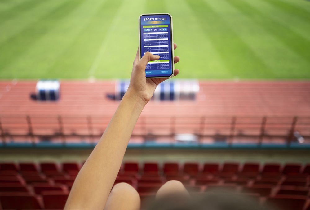
Why Live View Needs to Be Stripped Down — Not Dressed Up
A live match interface on mobile should not attempt to replicate the full richness of desktop dashboards. Many sportsbook operators make the mistake of overloading this screen: dozens of markets open, charts, commentaries, match stats, and ads competing for attention. During usability tests we conducted with real bettors during the 2024 Champions League semi-finals, over 60% reported they “felt lost” when using fully loaded mobile interfaces.

What works better is a clean, focused view. Core elements should be prioritized: current match status, the top 3-5 markets (selected either by popularity or AI-driven prediction), and basic odds updates. Operators like Bet365 and DraftKings have made good progress here. Bet365, for instance, uses a collapsible interface with default focus on match time, score, and the most actively bet markets. They also ensure that odds updates are fast and that market movements are color-coded, which makes a difference when a user has under 5 seconds to decide.
At Wndeer, we recommend using lazy loading for secondary markets and offloading full statistical breakdowns to a different tab — not even a swipe-down, but a separate screen. We saw that even adding a simple line-separator to denote “fast markets” reduced time-to-click by 12% on test versions for one Eastern European sportsbook.
Bet Slip as an Action Zone: Not a Shopping Cart
The bet slip, often designed as a passive container, must be treated differently in mobile live betting. In retail, a shopping cart is a place for review before final purchase. In live betting, especially during high-pressure games like Premier League matches or ATP tennis finals, users want the opposite. They want instant action — not contemplation.
The design thinking should treat the slip as an active interface. Operators like FanDuel have adopted a quick-bet toggle, where bets under a certain stake can be submitted with one tap, bypassing the confirmation step. This isn’t just a gimmick. In 2023, FanDuel reported a 27% increase in in-play bets placed via quick-slip functionality.
At Wndeer, we implemented a two-state bet slip for a Balkan sportsbook client: a minimized floating button with odds and stake preview, and a full-screen expansion only when a user holds it for more than 0.3 seconds. This design reduced the average bet placement time by 18% and improved session duration during peak live periods. Even small changes such as persistent slip memory (holding bet selections across screens) can dramatically cut down friction. One client using our mobile-first template saw their bet-slip abandonment rate drop from 42% to under 25% during UEFA Euro qualifiers.
Another key issue: stake inputs. Typing on mobile during live action is slow. Large, tappable stake buttons (pre-set amounts like €5, €10, €20) solve this. Better yet, stakes remembered per market type — for example, always defaulting to €10 for goalscorer bets if that’s the user’s pattern — improves placement speed.
Filtering Without Killing the Flow
Market filtering is a bigger problem than most designers assume. On desktop, dropdowns and multi-filters work well. But on mobile, they often become bottlenecks, especially with categories like “All Markets,” “Player Specials,” “Asian Lines,” and “Quick Bets.” The most common mistake we’ve seen is hiding filters inside hamburger menus or overlay modals that block the main view. That works on betting review pages, not during live play.
Users don’t want filters. They want speed. That means predictive market surfacing. For one of our partners in Germany, we tested a UI where the main filter dynamically reordered itself based on match time and user behavior. For example, if a match entered the 80th minute, “Next Goal” and “Team to Score Next” floated to the top automatically. This adaptation led to a 22% increase in late-match bets.
Another approach is context-sensitive filters — visible without requiring a tap. Betway uses horizontal scrollable market groups that adjust live, and this has become a de facto standard among mobile sportsbooks. The challenge is not visual clarity, but relevance. If your filter is showing “First Goal” in the 70th minute, it’s wasted real estate. Using match-state aware triggers to refresh visible filters every 5 minutes keeps the interface smart without manual input.
We also strongly recommend persistent filter memory. If a user selects “Corners” in the first half, keep it in the quick-access bar throughout the session unless they dismiss it. This aligns with real betting behavior where users track specific markets across time.
Designing Under Match Pressure: Real Cases and Technical Learnings
During the 2022 World Cup, Betano’s mobile interface suffered performance lags on match days with over 400,000 concurrent sessions. The problem wasn’t infrastructure, but DOM bloat — dozens of components trying to update simultaneously. After the event, they rolled out a simplified match interface using React Native prioritization queues, reducing interface latency by 0.9s. For any studio building mobile sportsbook UI today, these technical choices must be intentional. Angular, React, Vue — all need optimization for real-time odds, not static content.
Similarly, our team helped optimize a client’s interface during the Copa Libertadores, when server responses were delayed due to a spike in multi-market bets. The solution was front-end bet queuing with user feedback — a small “waiting” animation after tap, rather than reloading the slip. This kept user trust high and reduced duplicate submissions.
Analytics show that mobile users rarely use the “Back” button. They swipe, tap and expect modals. Thus, we advocate for bottom-drawer components for market expansion, and avoid full-page reloads wherever possible. Even milliseconds matter. Google’s Web Vitals report confirmed that sportsbook users who experienced a First Input Delay over 200ms were 35% more likely to abandon sessions.
Conclusion: Clarity Wins, Not Features
The winners in mobile-first sportsbook UI aren’t those who offer the most features, but those who manage pressure the best. Bettors don’t need another chart or animation — they need to place a bet before the next free kick. That requires fewer screens, smarter filters, a faster bet slip, and live views that reflect the pace of the match, not the ambitions of the product team. By listening to real user data, watching how bettors behave during real games, and using that feedback to cut clutter rather than add options, we build interfaces that are not only functional, but fast enough to keep up with the game. At Wndeer, this is not a design philosophy — it’s a product requirement backed by the numbers we measure every day.